by admin
The About Page on your website is the first thing that visitors look for. New or potential customers and even frequent ones need to know that they are dealing with someone genuine. t plays an essential role in building trust and creating meaningful engagements. That is why you need to do it right. A sloppy About Web Page gives off a bad impression and may harm engagements on your website.
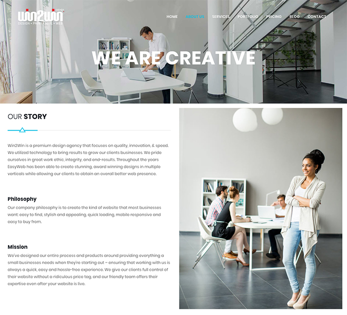
Win2Win’sAbout Web Page
Mistake #1 – You Don’t Have anAbout Web Page
You may think that an About Web Page is too obvious and there is enough content on your website to tell your customers about you. But, it is always a good idea to tell who you are, what you do and why. Not just for the sake of introductions but also to remind yourself where you are coming from and what really matters.
Mistake #2 – YourAbout Web Page is an Afterthought
Your About Page is something that should be there from the very beginning, not after you get everything going and in the end go “oh by the way, this is who we are”. Take this opportunity to connect with your customers and tell them your story.
Mistake #3 – YourAbout Web Page is Buried or Disguised
There is nothing more frustrating than navigating a website to find such basic information about a company. Nobody has got time to spend digging through your site to find out about you. The About Page should be very clear and easy to find, addressing basic curiosities.
Mistake #4 – YourAbout Web Page is Too Long & Impractical
Your About Page should be smart and concise. Not a prehistoric history of how you began, a detailed bio of your founders and customer reviews etc. Keep it simple and don’t overload it with information or make it too long.
Mistake #5 – YourAbout Web Page is a Video
While some people may like it, most people just lack the patience to sit through a 5-6 minute long video loaded with sounds and infographics, introducing your company and brand. Don’t make knowing about you a task for your visitors and instead provide answers to basic questions on your About page.
Mistake #6 – Too Stiff. Too Concise.
While being concise is a good thing, being too much of it is bad. Choose enough words and right ones that will resonate with your customers. Be honest and compelling about who you are but don’t be too stiff about it.
Mistake #7 – Not Showcasing Your Products or Services
Customers don’t need an extensive backstory about what you do or why you are so great. The need a basic idea of what you offer and how you will be creating value for them. Don’t assume customers know what you are offering rather let them know straight up.
Mistake #8 – Using Too Many Jargons
Don’t overload your About Web Page with industry jargons and insider lingo. You must come across as friendly and relatable, explaining about yourself in layman terms. Being professional does not have to mean throwing around big fancy words.
Mistake #9 – Being Too Clever
Thinking out-of-the-box is great, but don’t try to be so clever that you are miles away from the box altogether. It may reflect poorly on you as vanity or trying way too hard to get attention. Be creative but stick to being easy-to-understand as well.
Mistake #10 – Thinking YourAbout Web Page is About You
Your About Page should be relatable and give a sense of being there to serve. Not as an advertisement of how awesome your company is. Be humble in your words and allow your customers to resonate with your story.
Let us know what you think in the comments below.
We hope you enjoyed our article on 10 Reasons Your Company’s About Page Is Still Not Working. Did you know Win2Win can not only help you design anAbout Web Page, but we can design an affordable website for your business or company needs.
Recommended Posts
10 Social Media Mistakes And How To Avoid Them
August 21, 2020
How To Start A Blog
August 21, 2020

Best CMS for Websites (Content Management System)
December 13, 2019

